Themes
Perique Settings Page ships with six bundled visual themes. Each one is a single CSS file layered on top of the always-loaded core.css (which only handles structural layout). A theme controls colours, borders, spacing, typography, shadows — all the decorative concerns.
Picking a theme
Set the theme on any Settings_Page subclass via the $theme_stylesheet property:
use PinkCrab\Perique_Settings_Page\Page\Settings_Page;

class My_Page extends Settings_Page {

    protected string $theme_stylesheet = Settings_Page::STYLE_MATERIAL;

    // ...
}
Available constants on Settings_Page:
| Constant | File | Description |
|---|---|---|
STYLE_VANILLA | assets/themes/vanilla.css | Default clean modern look |
STYLE_MATERIAL | assets/themes/material.css | Material Design 3 with floating labels |
STYLE_BOOTSTRAP | assets/themes/bootstrap.css | Bootstrap 5 with floating labels |
STYLE_BOOTSTRAP_CLASSIC | assets/themes/bootstrap-classic.css | Bootstrap 5 with classic labels above |
STYLE_WP_ADMIN | assets/themes/wp-admin.css | Native WordPress admin |
STYLE_MINIMAL | assets/themes/minimal.css | Bare-bones, maximum density |
STYLE_NONE | '' | No theme — structural only |
You can also pass an absolute file path or a URL for a completely custom theme:
// Absolute path (must be under WP_CONTENT_DIR)
protected string $theme_stylesheet = __DIR__ . '/assets/my-theme.css';

// External URL
protected string $theme_stylesheet = 'https://cdn.example.com/my-theme.css';
Vanilla
Default theme. Clean, neutral palette with a blue accent, subtle borders, gentle shadows, and static labels above inputs. Intended to look “reasonably modern” without committing to any particular design system.
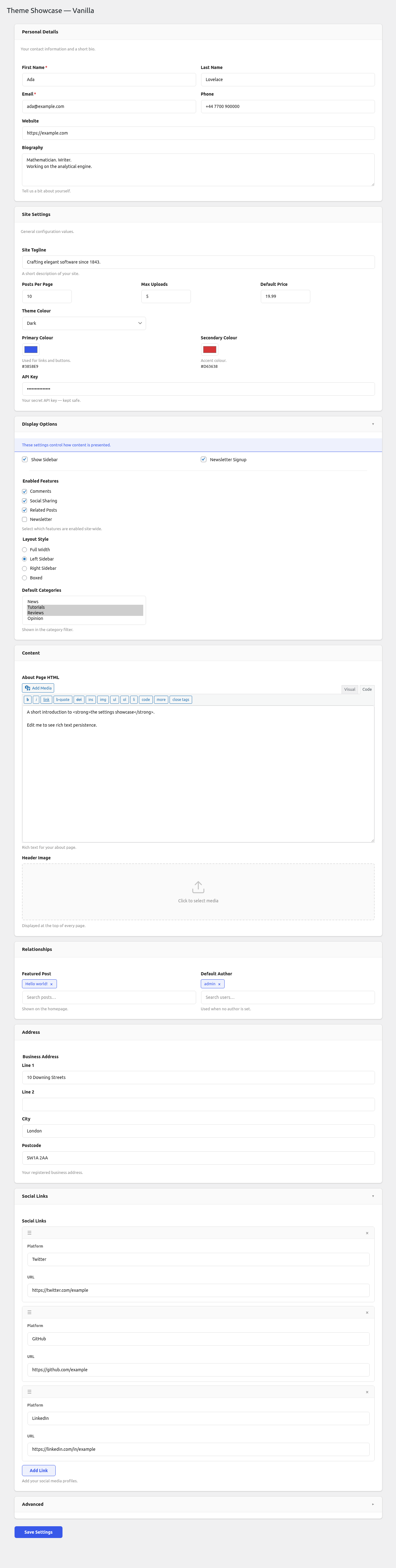
Accent: #3858e9 (indigo-blue) Labels: static, above inputs Sections: bordered card, subtle shadow Radius: 8px
Material
Material Design 3 inspired. Outlined text fields with floating labels that animate to the top border on focus or when the field has a value. Purple accent, soft elevated surfaces, rounded 16px sections.
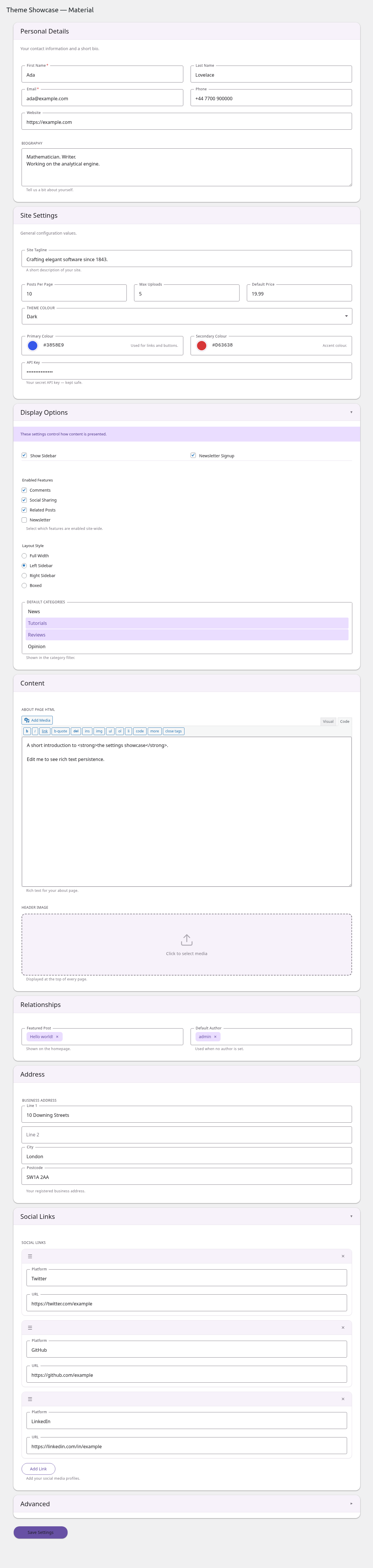
Accent: #6750a4 (Material purple) Labels: floating (inside input → on border) Sections: card with MD3 elevation shadow, no border Radius: 4px inputs, 16px sections Error icon: red circle with ! in the trailing end of failed inputs Required: red asterisk after label
Bootstrap (floating)
Bootstrap 5 styled with the .form-floating pattern. Labels scale and translate to sit inside the top of the input on focus/filled. Standard Bootstrap colour palette and focus rings.
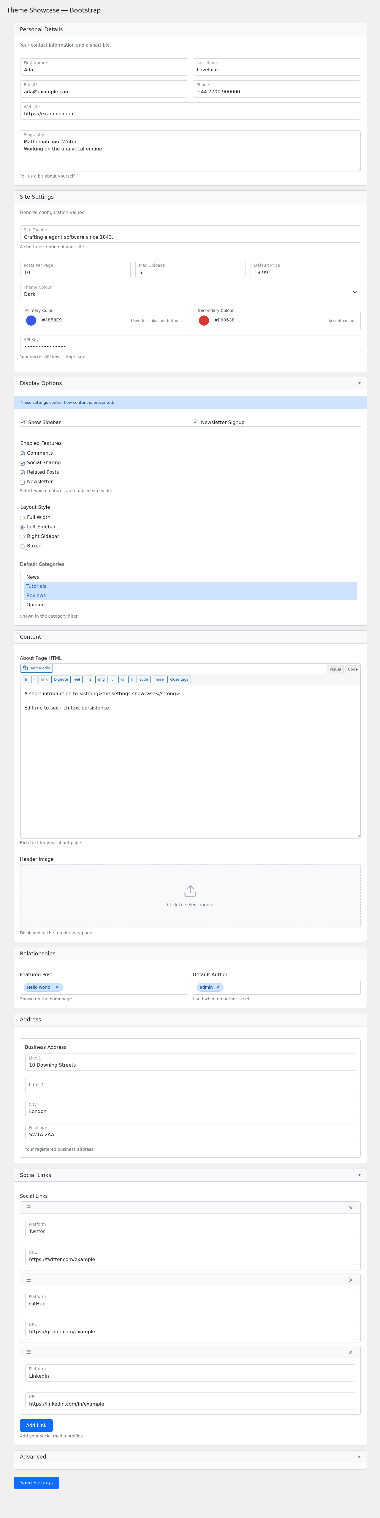
Accent: #0d6efd (Bootstrap primary) Labels: floating (inside input, scales down on focus/filled) Sections: Bootstrap card style Radius: 0.375rem Focus ring: 0.25rem outer glow (matches Bootstrap)
Bootstrap Classic
Bootstrap 5 with traditional non-floating labels (labels above inputs, always visible). Pink accent for a softer, friendlier feel than the blue default.
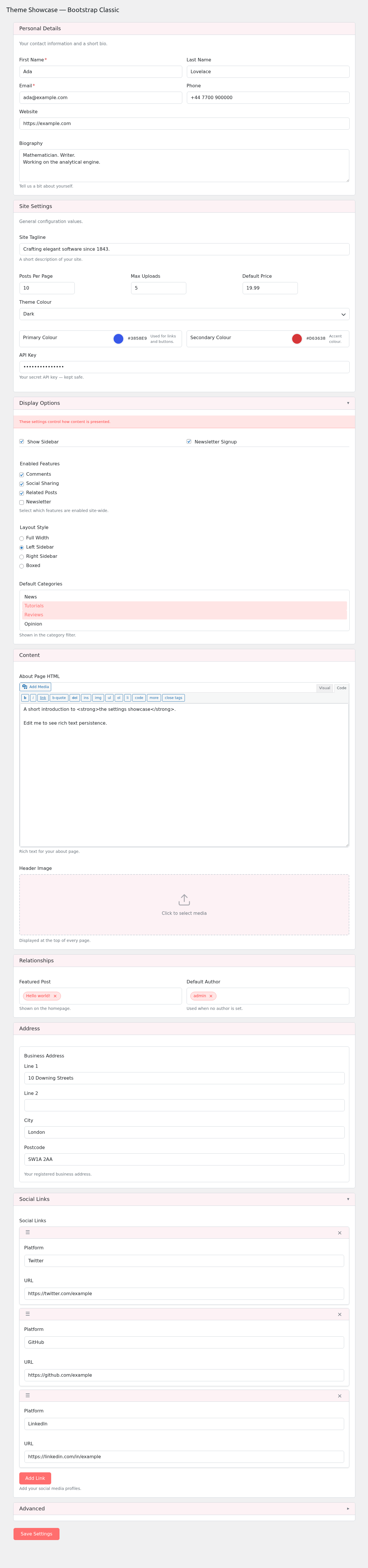
Accent: #ff6e6e (pink) Labels: static, above inputs Sections: Bootstrap card style Radius: 0.375rem Best for: forms where immediate label visibility matters (accessibility audits, older users, dense forms)
WP Admin
Blends with the native WordPress admin look. Small font sizes, WP blue accent, postbox-style sections, left-border notices. Best for plugins that want to feel like part of core WP.
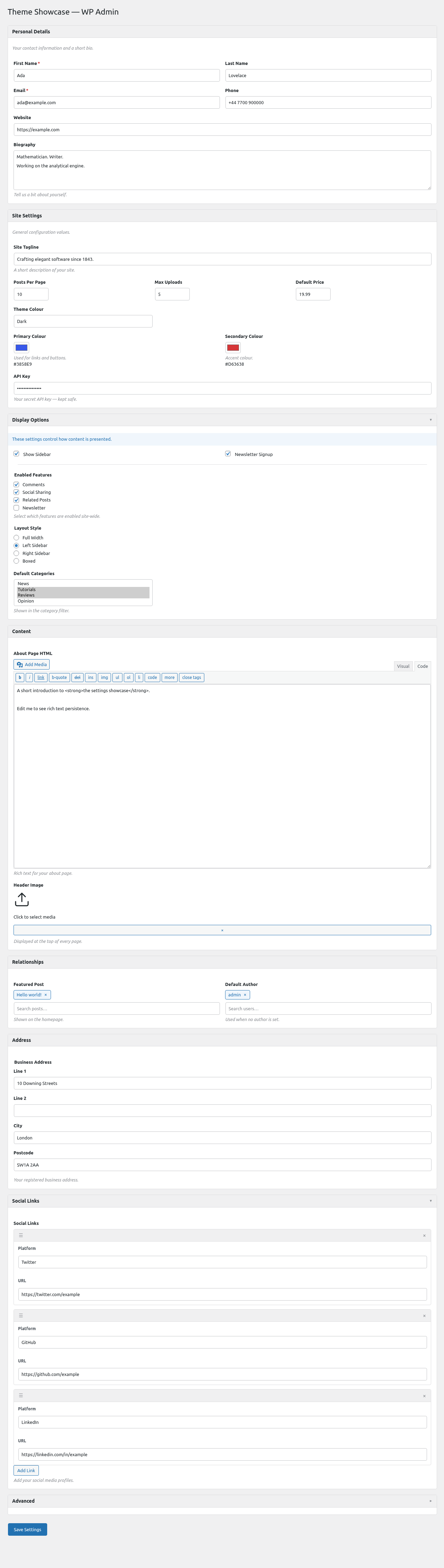
Accent: #2271b1 (WP admin blue) Labels: static, above inputs Sections: WP postbox style (subtle border, no shadow) Radius: 4px Fonts: 13px WP admin scale Best for: plugin settings that live inside a WP admin menu and should match surrounding core pages
Minimal
Bare-bones visual layer — no shadows, no rounded corners, no background tints. Uppercase section headings, maximum content density. Use when you want structural layout without visual decoration.
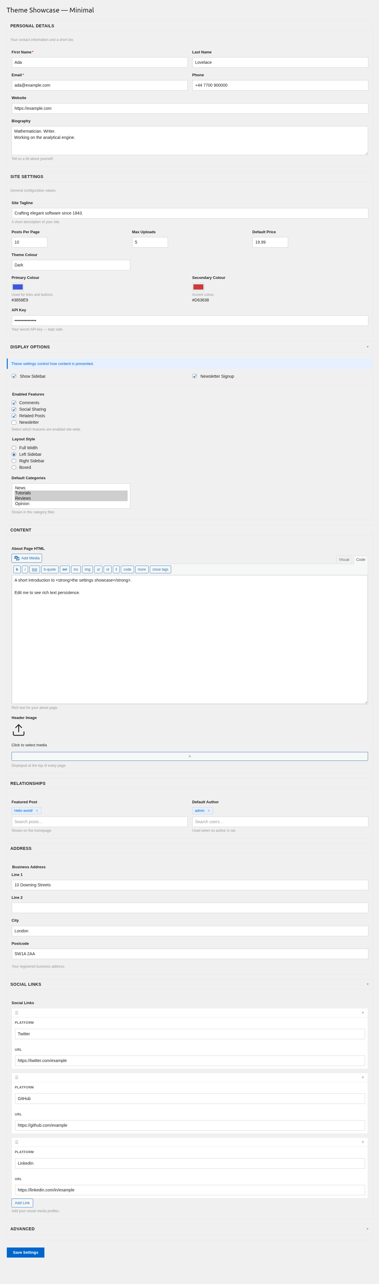
Accent: #0066cc Labels: static, above inputs Sections: single-border rectangle Radius: 0 (sharp corners) Best for: embedded admin tools, internal dashboards, places where the form is one piece of a larger interface
Core vs theme split
Every theme sits on top of assets/core.css which handles structural concerns only — layout, flex, grid, positioning, drag states. Visual decoration (colours, borders, shadows, typography) lives entirely in the theme file.
That split means a broken theme can only break how the form looks, not how it works. Validation still runs, repeater rows still add/remove, pickers still search, dropdowns still position correctly.
If you write a custom theme, you only need to style the visual layer — don’t re-implement any of the layout rules from core.
Regenerating screenshots
The screenshots above are produced by tests/e2e/specs/admin/theme-screenshots.spec.js. To rebuild:
WP_BASE_URL=http://localhost:57894 npm run test:e2e -- -g "Screenshot:"
Output lands in docs/screenshots/.